One well-known meteorologist thinks they can lead untrained users to draw unsafe conclusions

Anyone who makes decisions based on radar data displayed on mobile apps is essentially “acting the part of a meteorologist without the background,” and that will result in deaths, asserted meteorologist and certified emergency manager Dr. Kevin Kloesel, during the Ohio State University (OSU) Severe Weather Symposium March 28.
Kloesel, who works in the University of Oklahoma Office of Emergency Preparedness, was the final speaker of the day-long symposium, organized by OSU meteorology students.
A non-meteorologist will most likely be using a simple phone app, and tend to focus on the “scary colors” and lowest elevation tilt of the radar, Kloesel told symposium attendees.
As a case in point, Kloesel discussed a 2011 incident at the Indiana State Fair, where winds in advance of a severe thunderstorm caused the collapse of a temporary structure that held spotlights and other equipment above an outdoor concert stage, killing seven people.
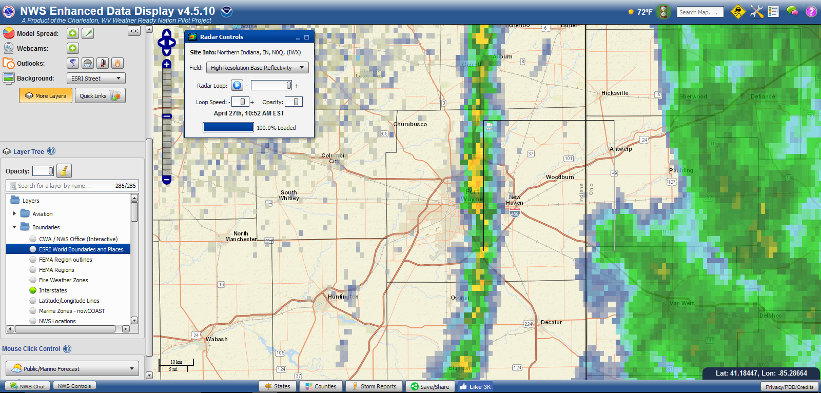
Kloesel showed archived radar data from that night, beginning with an 8:35 p.m. scan (see photo above) that depicted a line of heavy precipitation and ahead of that, a thin line representing an outflow boundary. Meteorologists know that such boundaries can indicate gust fronts with strong but usually sub-severe (less than 58 mph) straight-line winds.

Archived radar data depict the outflow boundary directly over the fairgrounds at 8:53 p.m (see photo above).
The deadly collapse, however, happened at approximately 8:46 p.m., much earlier than most untrained users of radar data might expect, in part because the “scary colors” had not yet arrived. Even non-meteorologists who recognize outflow boundaries likely don’t know that gust fronts on the ground occur ahead of where outflow boundaries appear on radar.

This is because a radar beam rises in reference to the ground as it travels from its source antenna (see photo above). Radar images therefore show what’s happening at the height of the radar beam, not at the ground
Trained meteorologists understand that they cannot assume that what’s happening on the ground will be indicated by what the radar depicts at beam height. Most other users of radar data on mobile apps probably lack that understanding, Kloesel said.
It’s too easy for people to rely on weather data via a mobile app, Kloesel said rather than seek expert consultation. The disconnect between the availability of data and the ability to correctly interpret such data is what led Kloesel to assert that radar app use can be dangerous.
This information is of particular importance to anyone who is responsible for the safety of people attending any outdoor mass gathering. All such events and venues should rely on trained meteorologists, versus others’ interpretations of what they see on mobile apps.
One way event leaders can get such support is through the National Weather Service’s Impact-based Decision Support Services (IDSS). The best way for event organizers to access IDSS is usually through a local emergency manager (i.e. director of an emergency management or homeland security agency).
Kloesel shared a quote from a lawyer involved in a weather-related injury case, who said that such incidents are “preventable with prudent caution and control of events in the face of available meteorological information.”